I Stopped Asking “How Is the Server?” and Built a Live Dashboard Instead
A hands-on guide to building a resilient Netdata-to-Microsoft Fabric real-time monitoring pipeline with a local spool, KQL aggregates, process Top 10s, and a mobile-friendly dashboard.
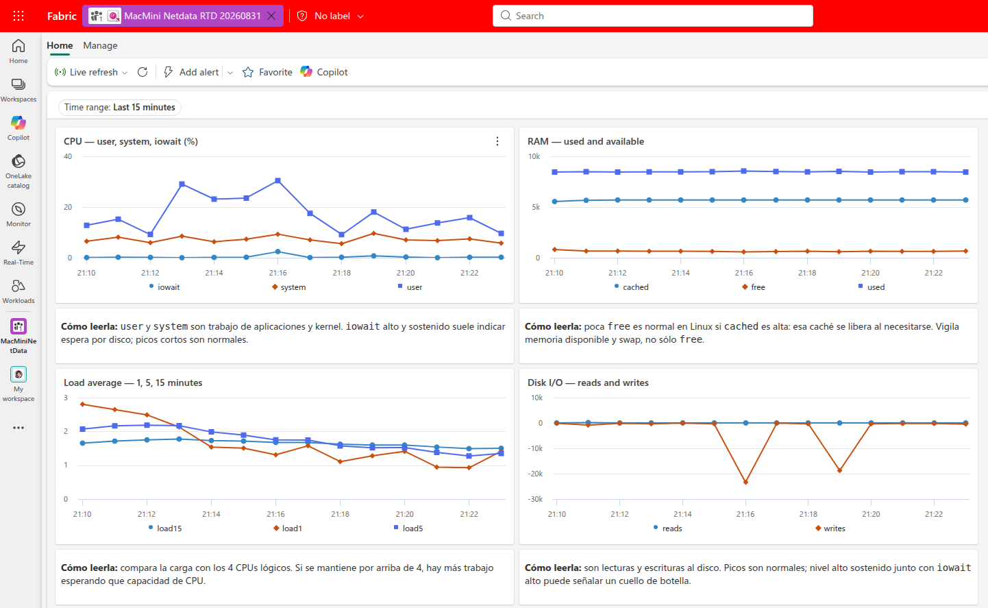
Editorial note: This is a first-person account of a real homelab deployment, validated on Ubuntu on August 31, 2026. Names, IDs, secrets, endpoints, and private infrastructure details have been intentionally omitted or generalized. The measurements in this post are a dated snapshot, not a performance guarantee.
For a long time, my monitoring workflow for a small Ubuntu Mac mini was embarrassingly manual.
I would notice something felt slow, then open an SSH session or ask an assistant a question: Is CPU high? Is the machine out of memory? Is the disk filling up? Which process is doing this? Netdata was already running, so the raw information existed. But the information was trapped in a local dashboard and in one-off terminal commands.
That setup works right up until it does not. The important problem was not “how do I collect more metrics?” It was: how do I make the machine explain its current state without requiring an investigation every time?
I wanted a dashboard I could open from another machine or an iPhone browser and immediately answer these questions:
- Is the Mac mini healthy right now?
- Is its CPU busy, or merely waiting on storage?
- Is “low free memory” actually a problem, or just Linux using cache correctly?
- Is a container, database, runtime, or monitoring agent responsible for a spike?
- Did telemetry stop, or is the machine genuinely quiet?
The result is a small but useful pipeline:
- Netdata collects local host telemetry.
- A deliberately boring Python collector selects, normalizes, and buffers the data.
- Microsoft Fabric Eventstream receives the events.
- Eventhouse/KQL stores and aggregates them.
- A Fabric Real-Time Dashboard turns the data into a live operational view.
This post explains how I built it, why I made particular trade-offs, what failed along the way, and how you can adapt the pattern without accidentally creating an expensive high-cardinality telemetry firehose.
Here is the full shape of the system:
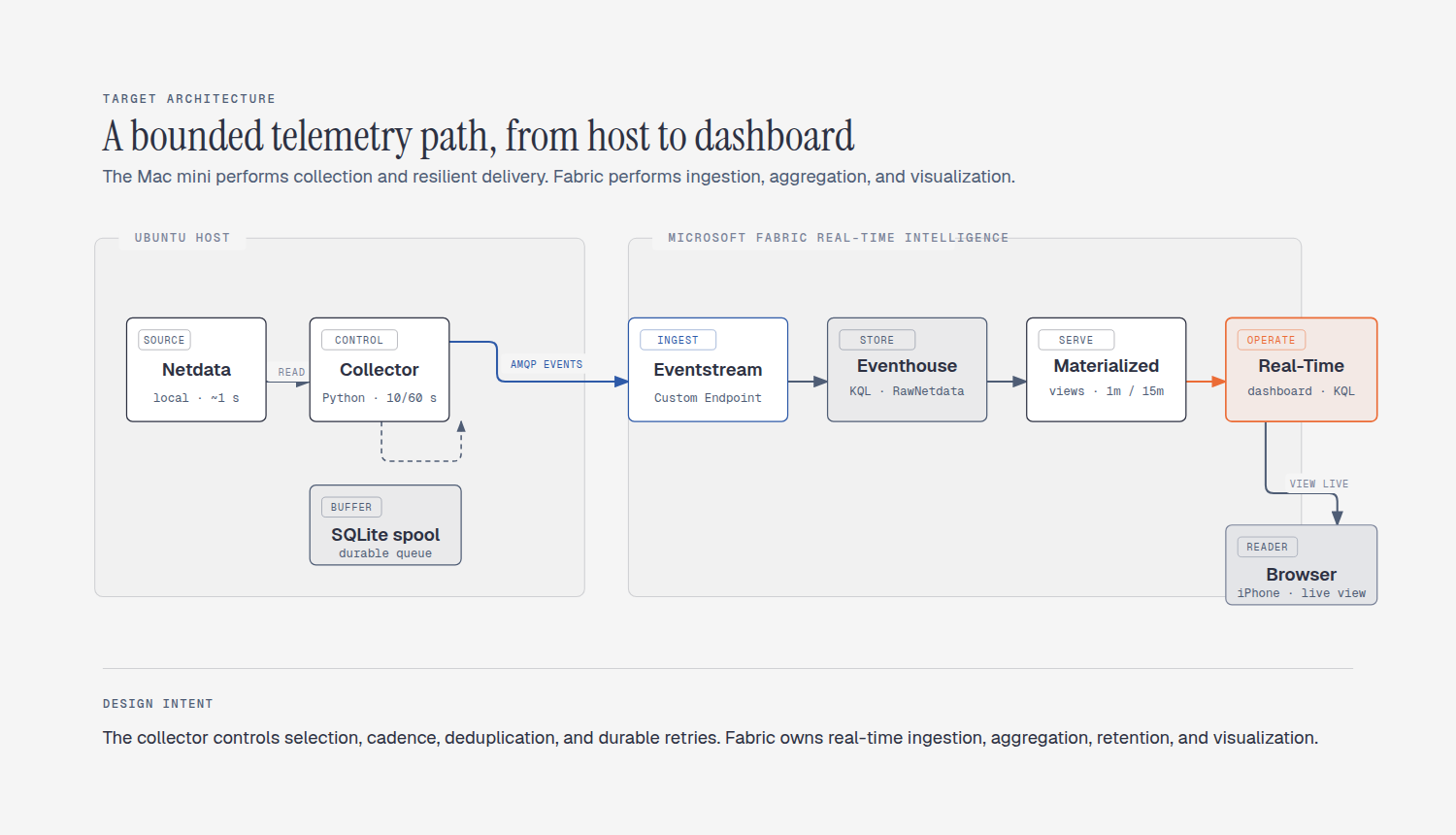
The key idea is that the host does only the work that must happen locally: reading Netdata, selecting a bounded set of metrics, serializing small events, and buffering failed sends. KQL queries, aggregation, retention, and rendering happen in Fabric.
That division matters. It keeps the monitored machine from becoming the analytics server for its own monitoring system.
Netdata exposes a huge amount of useful information. That is exactly why blindly forwarding all of it is usually the wrong first move.
A full export can create unpredictable volume and cardinality. Process names, containers, interfaces, mounts, and dynamically discovered dimensions can multiply quickly. It also makes it harder to answer a more basic question: which signals do I actually need to operate this host?
So I began with a short allowlist:
system.cpusystem.ramsystem.loadsystem.iosystem.netdisk_space./CPU package and core temperature chartsThis is not a claim that these are the only important metrics. It is a decision to start with operational signals that are easy to interpret and cheap to retain.
For each observation, the collector emits a long-form event like this:
{ "eventId": "stable-hash", "timestamp": "2026-08-31T00:00:00Z", "host": "example-host", "chart": "system.cpu", "metric": "system.cpu", "dimension": "user", "value": 12.3, "unit": "%", "labels": { "collector": "netdata-fabric-collector" }, "sourceIntervalSeconds": 10, "ingestedAt": "2026-08-31T00:00:01Z"}Long-form events are not glamorous, but they are flexible. CPU, RAM, networking, storage, temperatures, and application groups all arrive with the same basic shape: timestamp, chart, dimension, value, and unit.
Before touching Fabric, I validated what Netdata was already collecting locally.
The host ran Netdata on its local loopback interface. A quick API check showed the system CPU chart returning consecutive timestamps at approximately one-second intervals. This was an important discovery: I did not need to create a second collector running every second just because Netdata had that granularity.
I intentionally separated two clocks:
- Netdata’s local collection cadence: roughly one second.
- The outbound collector cadence: 10 seconds for host metrics.
That gives a dashboard that feels live without forwarding ten times more data than the operational use case needs.
The collector’s job is simple on paper:
- Call Netdata’s API for each allowed chart.
- Read the latest data point and dimensions.
- Normalize them into JSON events.
- Generate an idempotency-friendly event ID.
- Store events locally before attempting to send them.
- Send a bounded batch to Fabric.
- Remove only successfully sent events from the local queue.
The local queue is a SQLite database. I chose SQLite because it is already available, durable enough for a small single-host collector, easy to inspect, and does not add another service to operate.
sequenceDiagram
    autonumber
    participant N as Netdata API
    participant C as Collector
    participant S as SQLite spool
    participant E as Fabric Eventstream
    participant K as KQL Database

    loop Every 10 seconds
        C->>N: Read allowlisted charts
        N-->>C: Latest values + dimensions
        C->>C: Normalize and create stable event IDs
        C->>S: Insert events first
        C->>E: Publish a batch
        E->>K: Route into raw table
        C->>S: Delete only sent rows
    end
The important line is “insert events first.” A network interruption should not mean a blind gap in the timeline. If Eventstream or the network is unavailable, the spool accumulates pending rows. When connectivity returns, the collector sends them in batches.
In my test, the collector used approximately 0.63% of one CPU core, about 54 MiB RSS, and one thread. That is a dated measurement on one particular host, not a universal baseline, but it confirmed that the incremental cost was small for this use case.
This is intentionally sanitized. Keep connection strings outside Git and restrict their file permissions.
NETDATA_URL=http://localhost:19999INTERVAL_SECONDS=10NETDATA_CHARTS=system.cpu,system.ram,system.load,system.io,system.net,disk_space./SPOOL_DB=/home/USER/.local/state/netdata-fabric-collector/spool.dbMAX_SPOOL_ROWS=250000BATCH_SIZE=100TOP_APPS_LIMIT=10TOP_APPS_INTERVAL_SECONDS=60DRY_RUN=trueEVENTHUB_CONNECTION_STRING=[REDACTED]The first run should use DRY_RUN=true. It lets you validate the Netdata API, event normalization, file permissions, and expected event count before a credential is used to send actual data.
The Fabric resources were created in this order:
- A workspace with a service principal granted Contributor access.
- An Eventhouse.
- A KQL Database inside the Eventhouse.
- A raw table and JSON ingestion mapping.
- An Eventstream with a Custom Endpoint source.
- A destination from the Eventstream to the raw KQL table.
- Materialized views for 1-minute and 15-minute aggregates.
- A Real-Time Dashboard querying the aggregates.
Fabric Eventstreams support Custom Endpoint sources so an application can send real-time events into an eventstream. Microsoft documents the Custom Endpoint flow and the permission requirement of Contributor or higher for editing an eventstream.[1]
The eventstream was configured with a Custom Endpoint and the collector used the Event Hubs-compatible connection details with the Azure Event Hubs Python SDK. The connection string stays in a local protected file; it never belongs in a blog post, repository, terminal transcript, or Slack message.
A raw table is the contract between the collector and the analytics layer. It is where I want a predictable schema, not clever transformations.
The table contains the fields required to answer basic questions later:
- When was the measurement produced?
- Which host produced it?
- Which chart and dimension does it represent?
- What numeric value and unit did it have?
- When did the collector ingest it?
That separation also helps with troubleshooting. If a dashboard is empty, I can ask whether the issue is at the source, the collector, the spool, the Eventstream, the raw table, or the aggregate. Without raw data, those stages blur together.
The raw table is useful for short-window diagnosis. It is not the best target for every dashboard tile.
I created two KQL materialized views:
NetdataMetrics_1mNetdataMetrics_15m
Each groups telemetry by host, chart, dimension, unit, and time bucket, then calculates average, minimum, maximum, sample count, and last-ingested time.
.create materialized-view with (backfill=true) NetdataMetrics_1mon table RawNetdata{ RawNetdata | summarize AvgValue = avg(Value), MinValue = min(Value), MaxValue = max(Value), Samples = count(), LastIngestedAt = max(IngestedAt) by WindowStart = bin(Timestamp, 1m), Host, Chart, Metric, Dimension, Unit}A materialized view is an aggregation query over a source table. Fabric’s documentation explicitly frames it as a summarize-based aggregation and notes that it can be queried as an up-to-date result of that aggregation.[3]
This gave me a useful split:
- Raw telemetry: recent, granular diagnostics.
- One-minute aggregate: operational dashboard charts.
- Fifteen-minute aggregate: freshness and longer trends.
A monitoring dashboard should not require a second dashboard to explain the first one.
I added charts for CPU, memory, load, I/O, network, temperature, root filesystem capacity, and telemetry freshness. More importantly, I added a short Markdown interpretation card below each chart.
For example:
- Low
freememory alone is not an incident in Linux. Page cache is reclaimable; watch available memory, swap growth, and symptoms. - Load should be compared with logical CPU count. A load that stays above available CPU capacity means work is waiting.
- High I/O plus high iowait is more interesting than high I/O alone.
- A freshness tile is a monitor for the monitor. If it goes stale, the data path needs attention.
Fabric Real-Time Dashboards support live refresh, time-series exploration, markdown tiles, and KQL-backed visual tiles.[2]
I created and updated the dashboard through Fabric’s API. That made the layout reproducible, but it also revealed an easy-to-miss problem: the JSON schema is sensitive to visual type.
When I added Markdown explanation tiles, Fabric rejected the dashboard definition several times. The most useful lesson was not a magic JSON snippet. It was this workflow:
- Publish a small change.
- Read the exact validation error from the UI.
- Download the published definition.
- Compare the affected tile type with the schema.
- Apply the minimal correction.
- Re-read the definition after publishing.
For this dashboard, Markdown cards needed visualOptions: {}. A field that looked harmless—usedParamVariables—was rejected by the runtime validator, so the final definition removes it from every tile.
This is mundane engineering, but it is better than treating a dashboard definition as unstructured JSON and guessing until the UI loads.
A host-level dashboard tells you that something is happening. The next question is always what is doing it?
Netdata’s applications collector exposes CPU utilization and RSS memory usage at the application-group level. Its CPU metric has user and system dimensions, and its RSS memory metric reports in MiB.[4]
It would be tempting to export every application group every ten seconds. I did not do that.
Instead, once per minute, the collector reads Netdata’s consolidated metrics endpoint, filters out stale charts, calculates a bounded ranking, and emits only:
- The top 10 application groups by
user + systemCPU. - The top 10 application groups by RSS memory.
# Conceptual logic, not copy-paste production code.for app_group in active_application_groups:    cpu = app_group.user_cpu + app_group.system_cpu    ram = app_group.rss_mib
emit(top_10(cpu_groups), chart="top.apps.cpu")emit(top_10(ram_groups), chart="top.apps.ram")
The stale-chart check matters. The consolidated endpoint can contain groups that are no longer being updated. Without checking last_updated, a historical value can incorrectly win the ranking.
The KQL query for a dashboard tile is short once the data is shaped correctly:
materialized_view('NetdataMetrics_1m')| where Chart == 'top.apps.cpu'| summarize arg_max(WindowStart, AvgValue) by Dimension| project Dimension, Value = AvgValue| top 10 by Value descOne subtle KQL lesson: arg_max(WindowStart, AvgValue) returns both the timestamp and the value. Project the numeric value explicitly before using it as a chart axis. Otherwise it is easy to point a visual at the timestamp by accident.
The finished architecture is simple. The path to it was not.
The first collector validation failed because it had an individual key instead of the full Event Hubs-compatible connection string. The fix was straightforward, but the preventive rule matters more:
Validate the shape of a secret locally without printing the secret.
In this case, the expected value starts with Endpoint=sb:// and includes the required connection fields. The value stays in a permissions-600 environment file.
The Eventstream destination needed the identifier for the KQL Database, not its parent Eventhouse. Both resources were visible, both had valid IDs, and using the wrong one produced a configuration that looked plausible but was not correct.
Whenever a platform has parent and child resources, write down the identity boundary explicitly. “The Eventhouse” and “the KQL Database inside the Eventhouse” are not interchangeable nouns.
Immediately after enabling the collector, the first KQL checks returned no rows. The pipeline was not necessarily broken; the data simply had not completed the Eventstream-to-KQL path yet.
The fix was bounded patience plus evidence:
- Check collector logs.
- Check the SQLite spool count.
- Wait a short, explicit window.
- Query the raw table again.
- Check ingestion failures rather than assuming empty means broken.
Early Top 10 CPU output included groups with old timestamps. The collector was ranking stale observations as if they were current.
The fix was to reject application charts older than two application-snapshot intervals. That changed the Top 10 from a historical list to a live operational ranking.
The most meaningful improvement is behavioral, not technical.
Previously, diagnosing the Mac mini started with an SSH session and a question. Now I can open the dashboard and observe:
- Whether CPU is active in user space, kernel space, or waiting on I/O.
- Whether low free memory is benign cache usage or part of a larger pressure story.
- Whether load exceeds the host’s logical CPU capacity.
- Whether disk I/O, network traffic, or temperature changed with the slowdown.
- Whether telemetry itself is fresh.
- Which application group is currently using the most CPU or RAM.
This is not a replacement for logs, profiling, or a full incident workflow. It is a better starting point for all of them.
When you adapt this pattern, I recommend keeping the following checks close to the code.
# Is the collector healthy?systemctl --user is-active netdata-fabric-collector.service
# What did it do recently?journalctl --user -u netdata-fabric-collector.service \  --since '30 minutes ago' --no-pager
# Is there a local delivery backlog?python3 - <<'PY'import sqlite3from pathlib import Path
spool = Path.home() / '.local/state/netdata-fabric-collector/spool.db'with sqlite3.connect(spool) as db:    print(db.execute('SELECT count(*) FROM spool').fetchone()[0])PY
A spool count of zero means there is no locally queued backlog. A nonzero count is not automatically an emergency; it is a signal to correlate with collector logs and Fabric ingestion health.
- Validate access before building. Confirm workspace access, roles, KQL permissions, and the Custom Endpoint path before adding a collector or credentials.
- Use dry runs. Validate event shape, event count, file permissions, and spool behavior before enabling outbound telemetry.
- Bound cardinality at the edge. The collector is the right place to decide what deserves to be stored. A Top 10 is usually more useful than an unlimited process inventory.
- Treat the spool as a first-class health signal. A persistent queue is not just a reliability feature; it is the clearest indicator that delivery is lagging.
- Make dashboard changes reproducible. Keep dashboard definition scripts, update them idempotently, and inspect the published definition after each change.
The natural next step is alerting: stale telemetry, sustained temperature, low disk space, or sustained CPU/load thresholds are good candidates for Fabric Data Activator.
I would also consider a separate longer-term trend view built from the 15-minute aggregate, and eventually a Power BI report optimized specifically for phone layouts. Those are improvements, not prerequisites. The core win already happened: the server is now observable in a way that is live, explainable, and accessible without opening a terminal.
The most useful monitoring system is not necessarily the one with the most metrics. It is the one that turns a vague feeling—“something might be wrong with the server”—into a short list of evidence-backed next questions.
For this homelab, Netdata remained the local source of truth, Fabric became the real-time analytical layer, and a small collector provided the control point between them. That was enough to replace repeated ad-hoc questions with a dashboard I can read for myself.
[1] Microsoft Fabric, Add a custom endpoint or custom app source to an eventstream
[2] Microsoft Fabric, What is Real-Time Dashboard?
[3] Microsoft Fabric, Create and edit materialized views
[4] Netdata, Applications collector metrics